How to use textures in interior design
How to use textures in interior design
In the world of interior design, textures play a pivotal role in creating visually engaging and inviting spaces. The art of mixing and matching textures is a skill that can elevate the aesthetics of any room, adding depth, character, and a touch of luxury. The key lies in striking a balance and letting the textures work together to create a cohesive and inviting environment. Here’s a glimpse into some of the textural elements can be used.
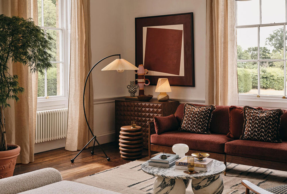
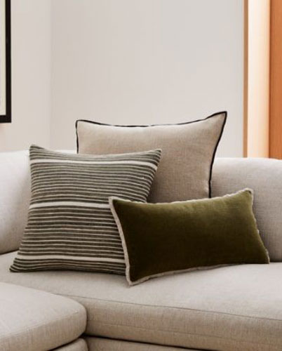
Diverse fabrics to create movement
One of the most effective ways to introduce texture is through fabrics. Experiment with a mix of fabrics like velvet, linen, wool, and silk. Consider combining smooth and plush textures with more tactile and rough fabrics. A velvet sofa paired with a chunky knit throw, for example, can create a nice contrast that not only looks appealing but also adds a sensory dimension to the space.
cushions@WestElm
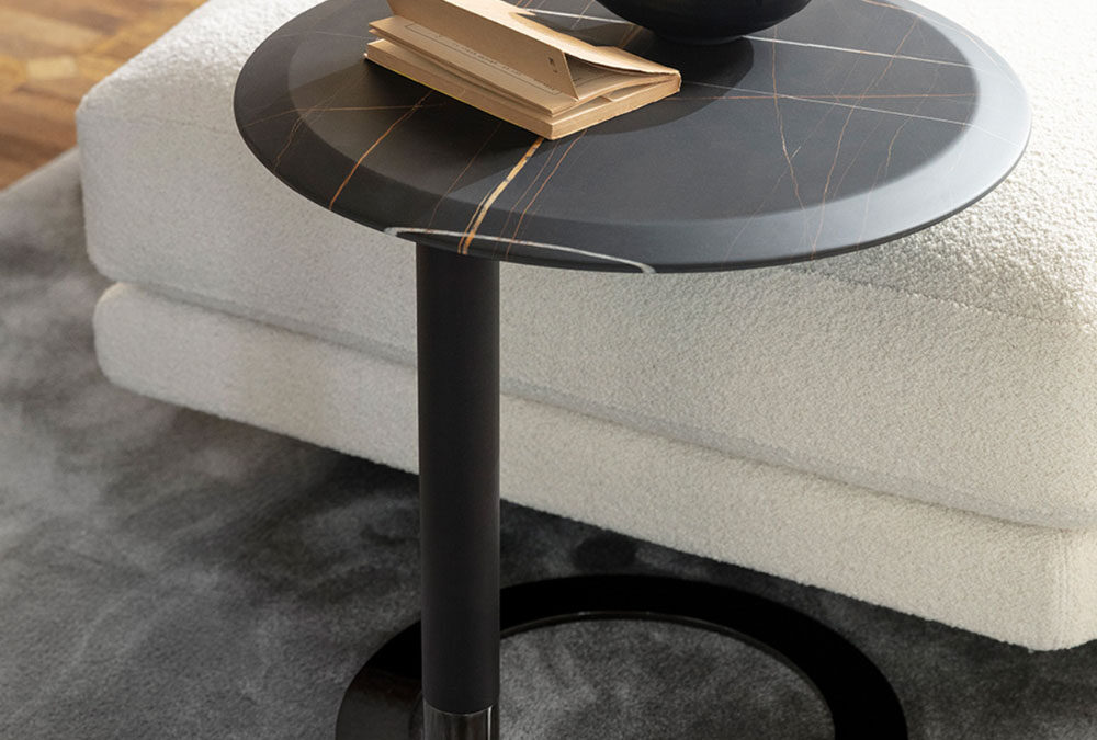
Balance hard and soft surfaces
Incorporate a balance of hard and soft surfaces to create a harmonious blend. Pair sleek, glossy surfaces with soft, matte textures. For instance, a glass coffee table on a plush rug or a polished stone countertop juxtaposed with wooden chairs. This interplay of opposing textures not only adds visual interest but also ensures a well-rounded design.

kitchen@RebeccaJansma
Natural elements for timeless appeal
Bring the outdoors in by incorporating natural textures like wood, stone, or rattan. These materials add warmth and a timeless quality to your interior. Consider a wooden accent wall, stone countertops, or rattan furniture to infuse a touch of nature’s textures into your living space.

rattan@SohoHome
Layering for depth
Layering different textures is a key technique in achieving a multidimensional look. Combine smooth with rough, shiny with matte, and coarse with fine. Incorporate throw pillows, blankets, and rugs in varied textures to create a rich and inviting atmosphere.

The power of plasterwork
Plaster can be molded into intricate patterns and designs, offering a wide range of decorative possibilities. Whether it’s ornate cornices, elegant ceiling medallions, or decorative wall panels, plasterwork allows for the creation of unique and bespoke elements that add character, movement and sophistication to any interior.

Statement wall treatments
Experiment with textured wall treatments to make a bold statement. Consider wallpaper with raised patterns, textured paint, or even reclaimed wood paneling. These additions not only serve as focal points but also add an extra layer of visual intrigue to your space.